Brigham Education Institute Mobile Application
Mobile App Development, User Research, Wireframing, UI/UX
An essential companion app that will enable all staff at Brigham and Women's Hospital to have a unique learning and development journey, helping them to maximize their potential for clinical and professional development by providing a guide to all the educational resources, events, tools and people that are available within the Brigham Education Institute.
Click here for the interactive prototype!
The Problem
The Brigham Education Institute (BEI) is the main department at the Brigham and Women's hospital that facilitates the implementation of teaching and educational resources and gives all Brigham staff and educators access to educational and professional opportunities. As such, it is crucial for there to be a way for all of these resources to be presented and readily available throughout the hospital.
One of the main problems was that all of the information such as events, presentations, readings, videos, etc. were all presented in an internal Airtable database, which was inaccessible for all staff and educators in the Brigham and the BEI team also found it extremely difficult to navigate such an extensive database for specific resources. A resulting problem from this was that although this information was intended to be available for the Brigham community, only a small handful of people accessed and used these resources because of its inaccessibility.
Users + Audience
The target users of the BEI app are healthcare professionals and educators who work at the Brigham and Women's hospital. When I created this application I had to create something that was simple, quick and easy to use in order to fit in with their busy schedules. I knew the user experience and workflows would also have to be straightforward so that anyone would be able to use them and that the designs were clean enough so it wouldn't detract from the actual content of the application.
Team + Role
I was the sole designer on this project, working with a team of developers and the technology lead at the Brigham Education Institute. I spearheaded and led the entirety of the design process including: an overall design direction, moodboarding, user research, task flows, wireframing, and prototyping. I worked alongside the rest of the team, conducting user research, attending check-in meetings, pitching ideas and changes, and iterating on the application during the beta testing phase.
Design Process
When I was approached about this project, I was presented with a rough timeline, stages, and goals for the overall mobile application, however the overall scope of the project and its main workflows had not been established. My first task was to work with the team to finalize what exactly we wanted the application to do and solidified the major workflows we wanted for our MVP. We identified pain points: wanted an easier way to access all of the resources at the Brigham and also be connected to events at the hospital. I have since iterated on the first version of the site map that was created and am currently working on the second version as well as iterating on the wireframes.
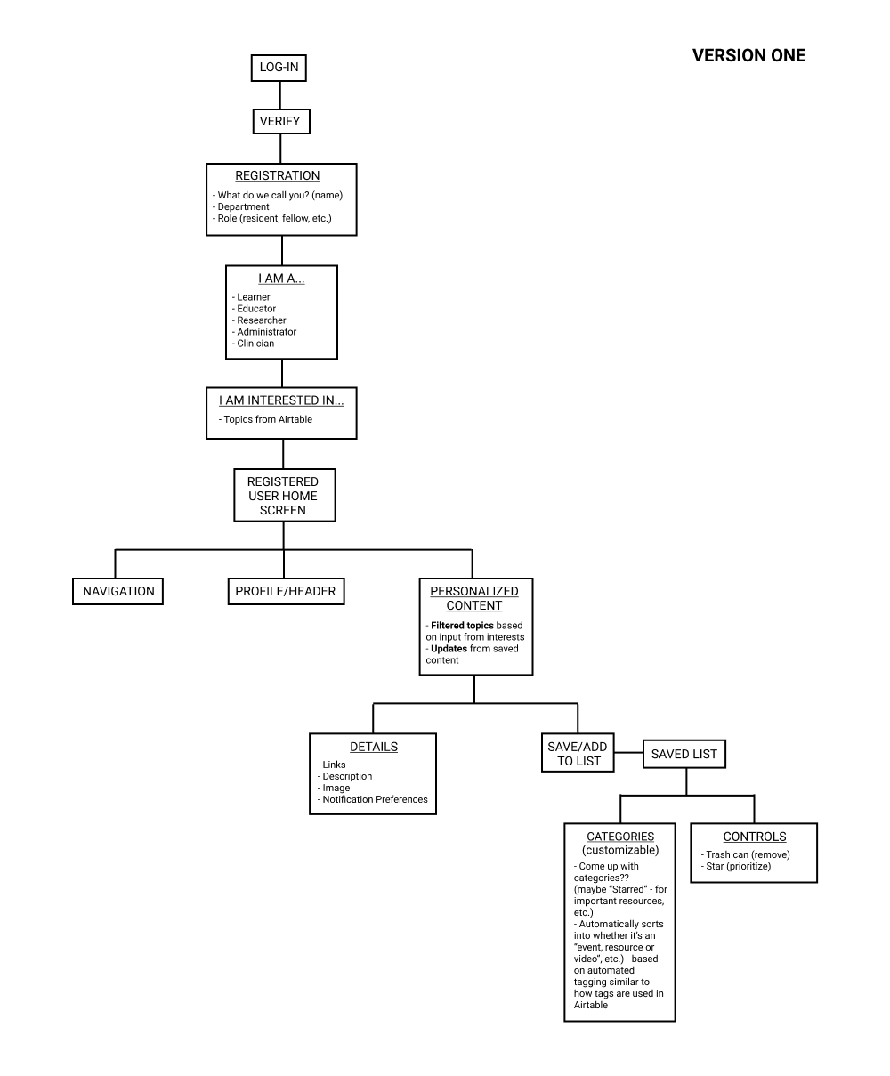
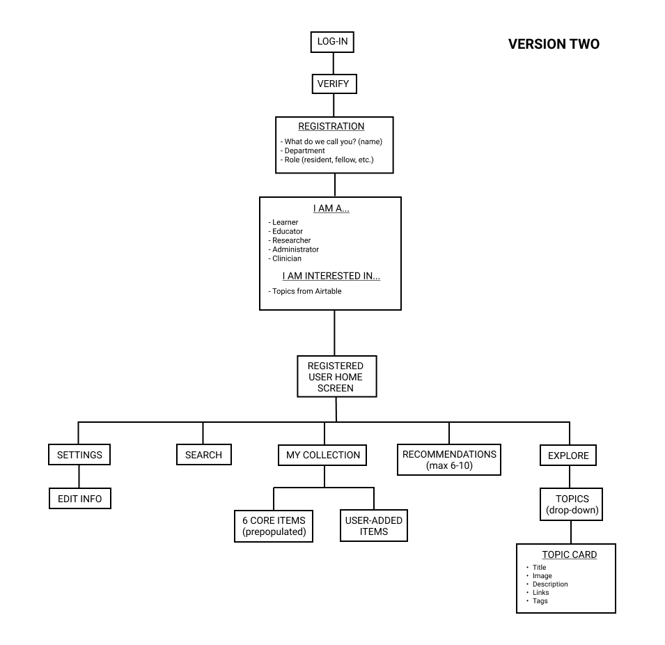
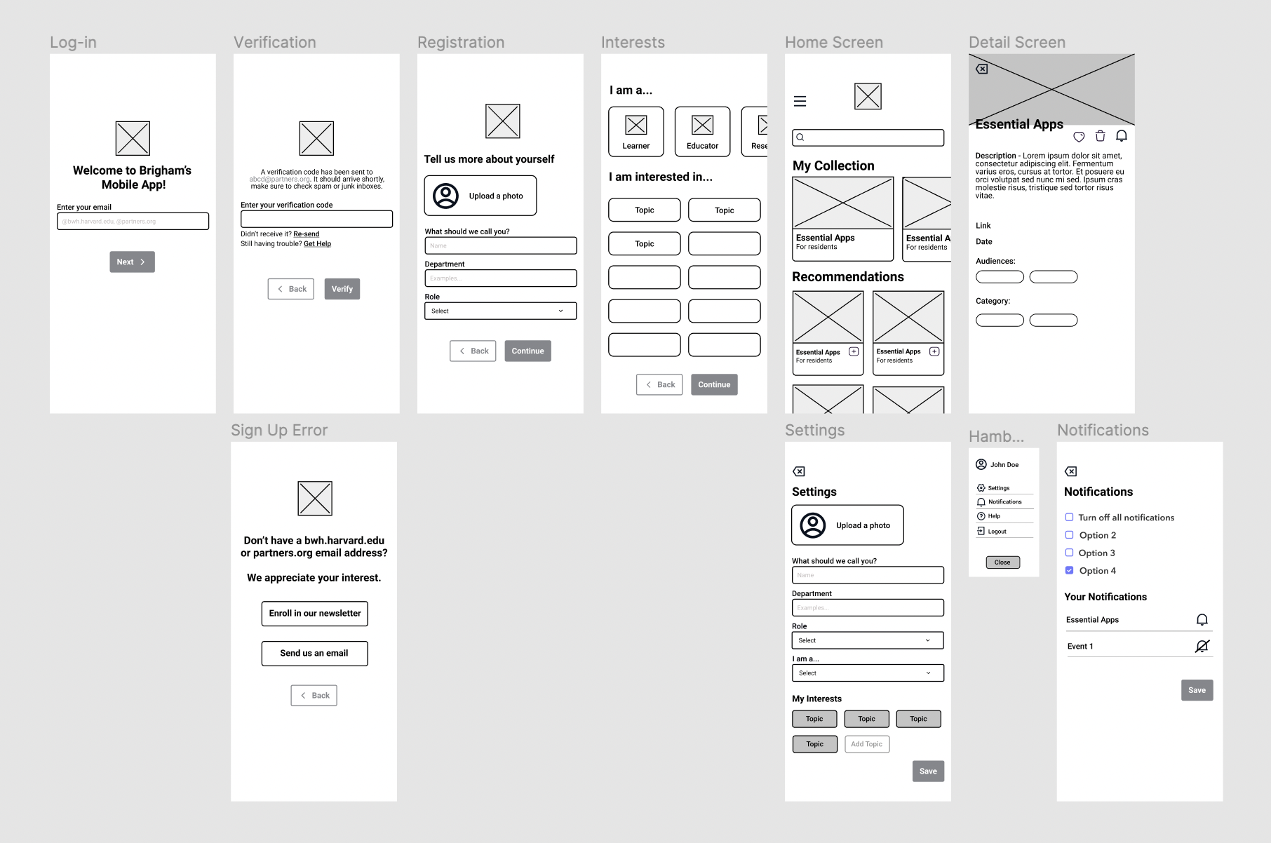
Once the workflows were established for the first version of the application, I was able to begin creating low fidelity wireframes to map out our MVP and get a better idea of how the application could potentially look as a whole. I took the pain points and workflows we had established in prior meetings and created version one of the design.
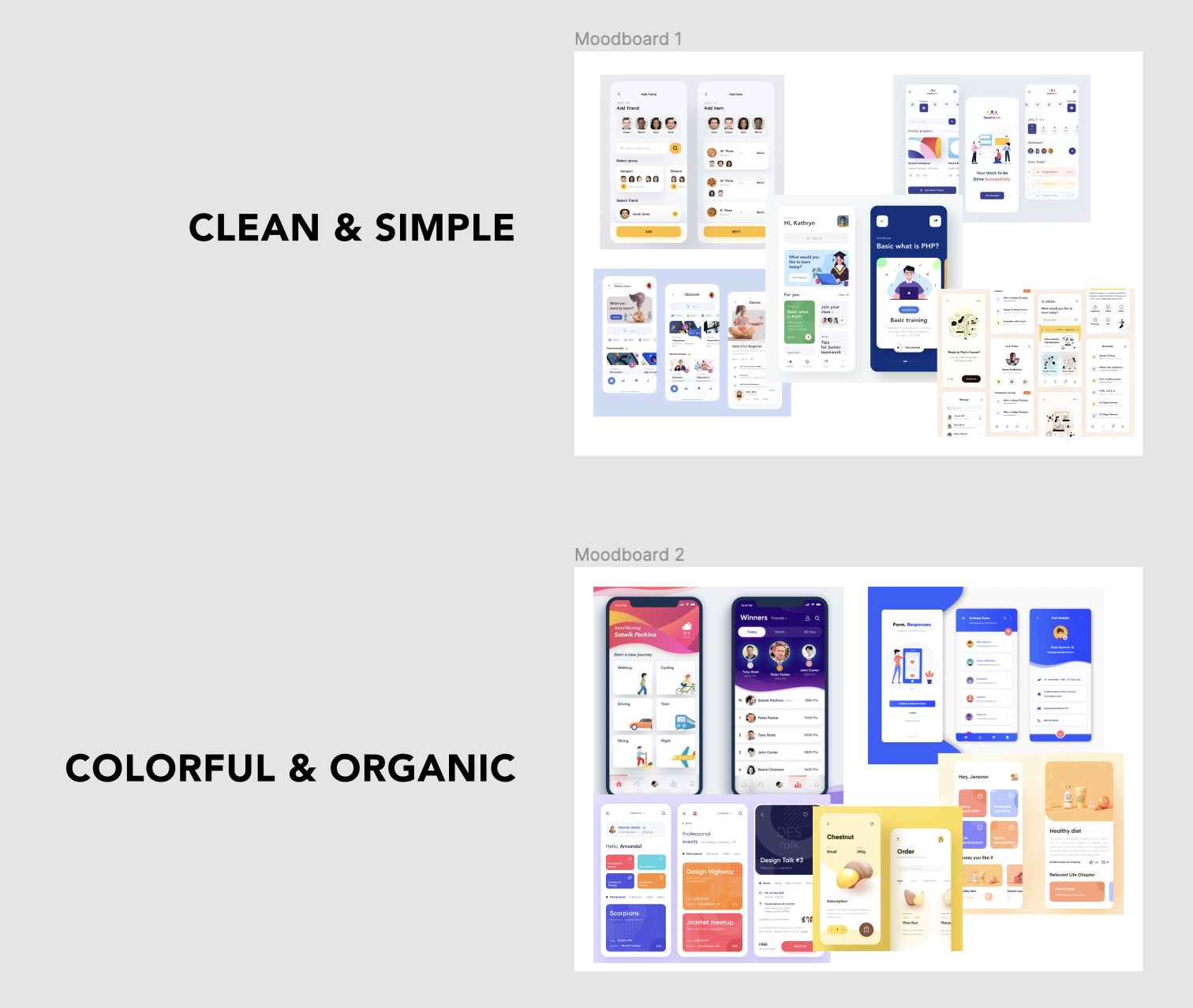
Based on the overall target users and the flow of the app, I knew the app needed to be easy to use and require minimal effort to access information and resources. I kept this in mind as I started researching different design directions to take this application. I created moodboards, compiling inspiration and examples from Dribble, Pinterest, and Behance.
Design System + UI Design
The overall theme of this application was inspired by a clean and simple feel while also incorporating subtle wave illustrations to add a touch of playfulness and create a slightly more organic design. I also wanted the application to feel welcoming and slightly more playful as most hospital resources and applications usually stick to a no-frills design and tend to feel more "sterile". I was able to achieve this through the use of rounded corners, bright illustrations and a card format used in user-friendly learning applications such as Socratic by Google, Duolingo, LinkedIn Learning. During this process, I also kept accessibility in mind, ensuring that all of the text and colors passed contrast checkers and also since this was a mobile application, that each of the buttons were large enough and distanced appropriately to minimize errors when the users were interacting with the components.
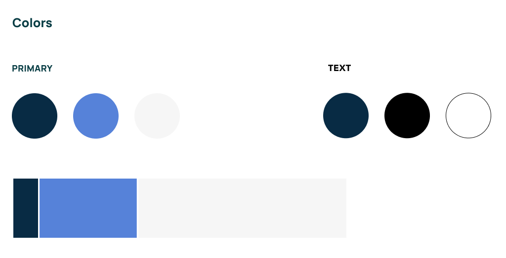
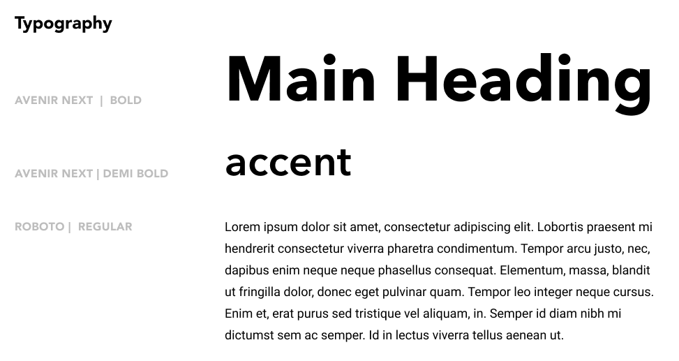
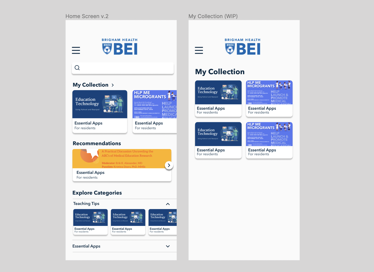
Once I established an overall design system and iterated on the lo-fi wireframes, I began working on combining the two to bring the high fidelity wireframes to life. This step required the most iteration once the initial prototype was created, and was released for initial user testing. One of the major iterations was to the home screen where I am currently working on additional iterations to version 2 and am also working on fleshing out the addition of a "my collection" screen which would allow for a more in-depth view of the user's favorited items and an expanded view of the preview on the homescreen.
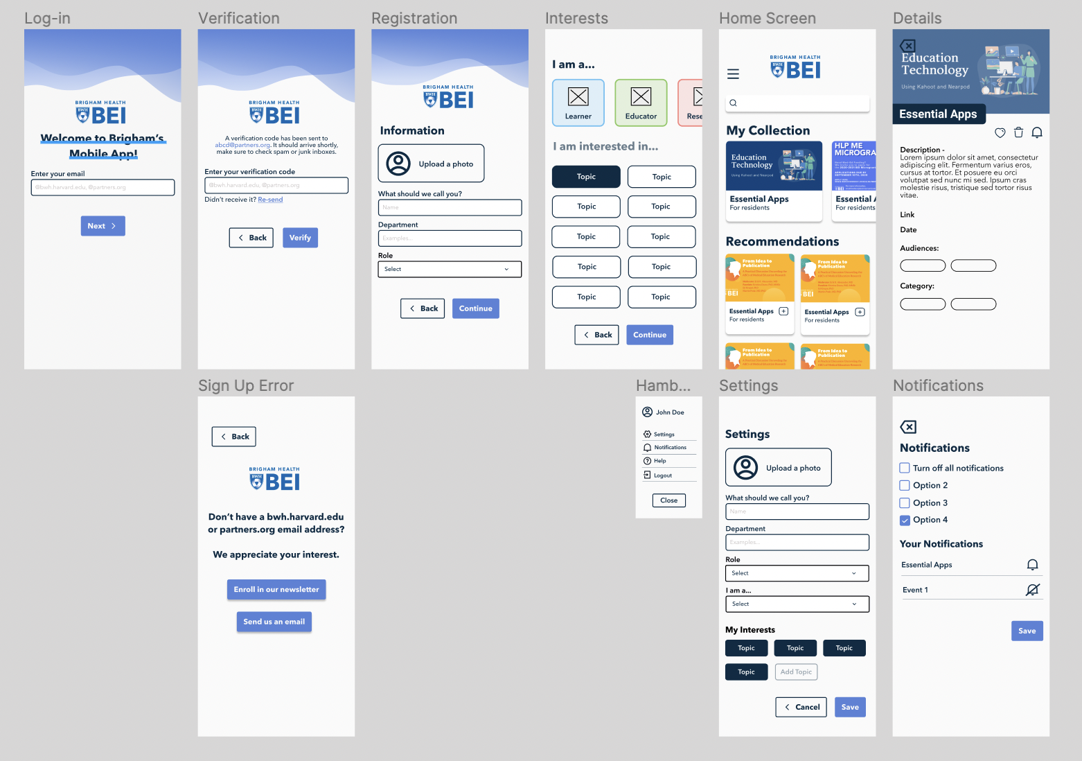
Once the prototype was created, it was sent to medical residents for feedback along with the team at the Brigham Education Institute. Upon gathering the feedback, I met with the team and the developers to go over new workflows and changes that needed to be made for the next version. It was also extremely helpful that during the time I was awaiting feedback, I was able to step away from the designs for a period of time so I would be able to go back to them with "fresh eyes" and re-evaluate the designs to make sure they were accessible and straightforward.
Outcome + Next Steps
The app is currently in the development and iteration phase. Version one of the wireframes have been developed using Swift UI and is currently being beta tested internally at the Brigham using TestFlight. I am continuing to meet regularly with the team to go over user feedback and am currently working on version two of the application which will continue to be reviewed and developed until an MVP is finalized for the first version of the app to be released to all of Brigham staff this fall. Some upcoming features include: daily updates/alerts, pre-populated resources for medicine residents and students as well as more fleshed out functionality for further user personalization.